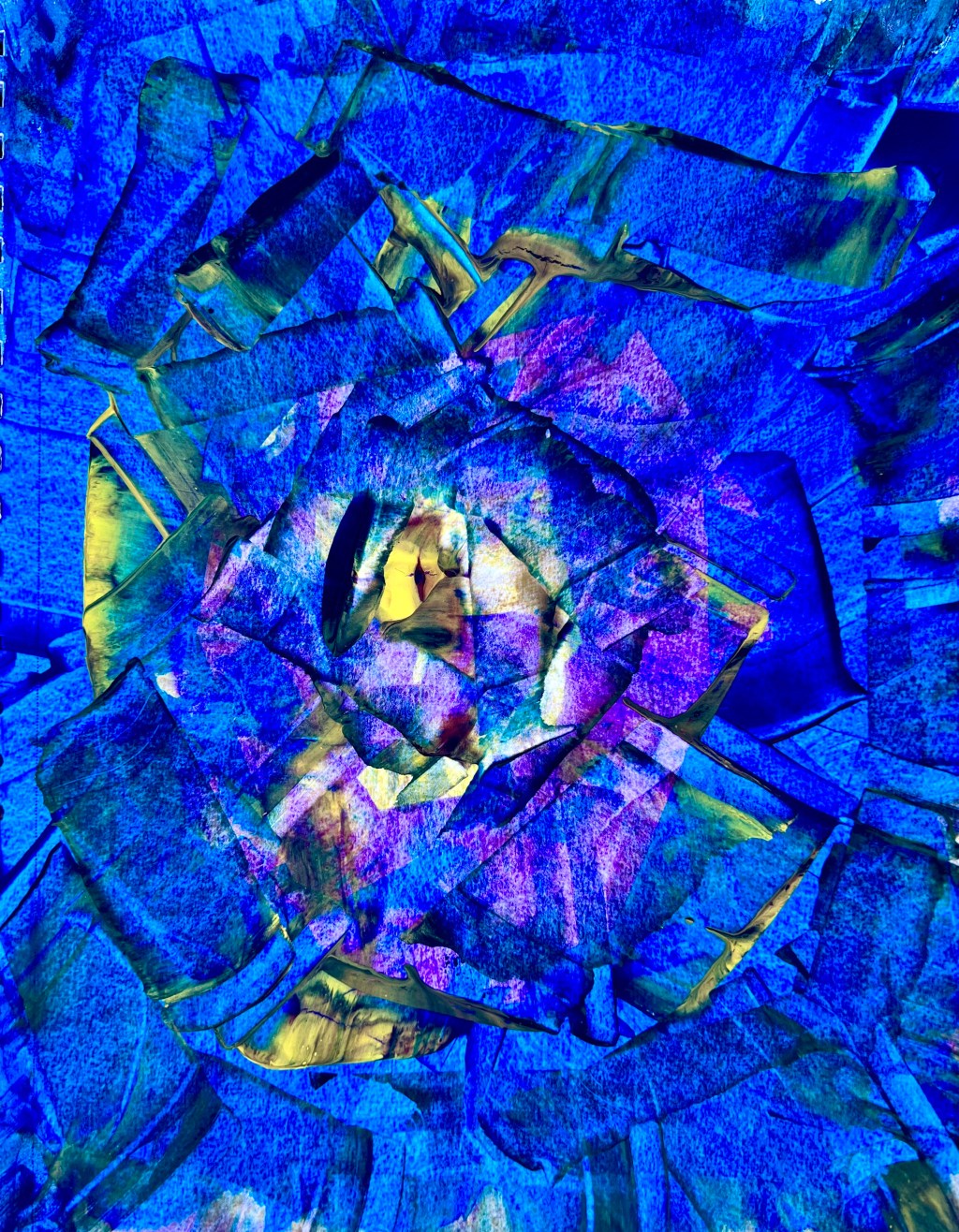
I’ve been creating these acrylic paintings in my 9″ x 12″ sketchbook lately, using only acrylic paint and using an old credit card to move the paint around. I love how the colors blend, and how some parts are almost transparent, yet there are sharp edges and it reminds me of ice. Maybe because I’m so cold lately, it actually dropped into the ’40s this morning, for San Diego, that’s cold! 😉 ❄
Have a wonderful weekend my friends, stay warm!!!!
I asked the question in reply to your comment, and here is the answer. I really like the shapes and texture you are getting with the CC. It has a really pleasing floral look to it.
LikeLiked by 1 person
Thanks so much, Tim!
LikeLiked by 1 person
Way cool vibrant abstract artwork with great energy, texture and movement, Tiffany! Have a great (and warm) weekend my friend! 🌞😎❄️
LikeLiked by 1 person
Thanks, Phil! We are up to 58 degrees now, the sun is shining, and it’s going to be a great day! ☺
LikeLiked by 1 person
Looks interesting
LikeLiked by 1 person
Thanks, Janice! ☺
LikeLiked by 1 person
gorgeous! 💖 it. ❄🥶
▪◾◼◾▪▫◽◻◽▫▪◾◼◾▪▫◽◻◽▫▪◾◼◾▪
▫◽◻◽▫▪◾◼◾▪▫◽◻◽▫▪◾◼◾▪▫◽◻◽▫
LikeLiked by 1 person
Many thanks, Graham!!!
LikeLiked by 1 person
Absolutely love this, Tiffany! Great title too! That is cold for SD!
LikeLiked by 1 person
Thank you, Michele! I’ve got my kitty keeping me warm! 😺
LikeLiked by 1 person
You are welcome. Perfect! 😺
LikeLiked by 1 person
Perfect title for your captivating painting! 😎❤️
LikeLiked by 1 person
Thank you so much, Sunnyside! ☺
LikeLiked by 1 person
My pleasure, Tiffany! 🙂
LikeLiked by 1 person
❤
LikeLiked by 1 person
Spectacular whirlwind of color! The blue, purple, green are perfect together and the texture of this powerful abstract is intriguing! New fav-of-fav’s!!! 👏👏👏👏👏
LikeLiked by 1 person
You are too kind, Robin, thank you so much! I’m quite taken with this one too, the colors are my fav!
LikeLiked by 1 person
This is excellent, my friend!
LikeLiked by 1 person
Thank you so much, I like it too! ☺
LikeLike
Beautiful.
LikeLiked by 1 person
Thank you, dear, I keep thinking about you and your kitty, I hope she is improving 🤗
LikeLike
Wow!! That is amazing!!!
LikeLike
Incredible escapism, kinda makes me feel the older Journey album covers,
LikeLiked by 1 person
Oh, yeah, right? Thanks Max, hope you’re having a great weekend!
LikeLike
The same and always the best to you and your amazing mind
LikeLike
It was like getting sucked into the most delicate part of a rare flower. Hypnotic. Stunning, Tiff.💜
LikeLiked by 1 person
I can’t think of anything better! Thank you, dear! 🤗
LikeLike
I like the credit card technique. The painting gets a lot of depth that way, and the blue colour is stunning. You are so creative
LikeLiked by 1 person
Thanks, love! It’s weird how taking away, adds more depth. Lots of fun experimentation! 😉
LikeLike
Love the look and yes it does have an ice connection…..stunning work as always!!
LikeLiked by 1 person
Many thanks, Kirt!
LikeLiked by 1 person
Tiffany, I’ve been looking at this again and comparing it to Coming Down and Invaded. I think the tonal range here, in this, is greater than in Coming Down, which, for me has much less impact because it has a such a shallow tonal range.
Invaded has a good tonal range but those blocks around the edge ( even though they are integral to the idea) seem to impact on the dynamics of the piece.
Others will disagree, maybe you as well, but that is my opinion for what it’s worth, but I hope it is of value to you.
LikeLiked by 1 person
I’m not sure how to reply, Graham, I will revisit this in the morning!😉 Of course, I always value and appreciate your thoughtful and inquisitive comments! ☺
LikeLiked by 1 person
As with all artistic viewpoints my views are subjective, so dont lose any sleep over it if you dont agree. I can see you are exploring this method of paint application – which I’ve used, myself, in the past and felt had potential – and I was wondering why some paintings grabbed me and others had less of an impact and I came to the conclusion that it was your use of tonal range and, to a lesser degree, colour combination that really pushed this application technique.
LikeLiked by 1 person
Yes, I totally get what you’re saying about the tonal range and less about the color. I’m particularly drawn to the effect of texture in these experiments.
LikeLike