
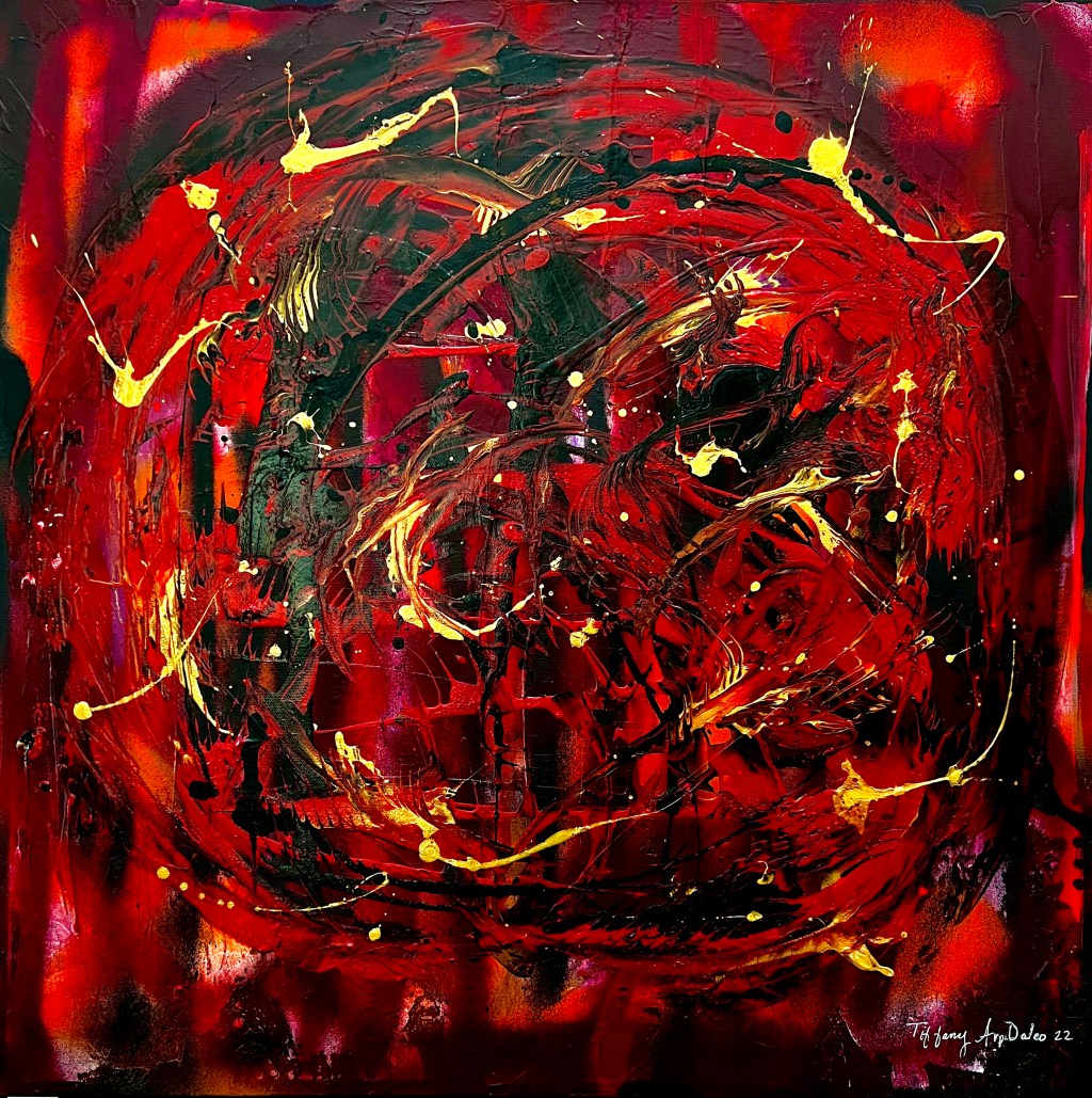
I need your help! I want to enter a juried art show next week, the theme is “Lipstick and Rouge” and I can’t decide which two paintings to submit!?

The theme of the show is: Hmmm, luscious reds…sultry maroons, hot magenta, dusty rose, funky fuchsia, cheeky pinkadelic, steamy crimson, juicy watermelon, gorgeous garnet, ripe raspberry, sexy scarlet, candy apple, peony pink, cherry blossom, ruby, cinnabar, merlot, blush, pomegranate, firelight, framboise, brick, coral, cerise, carnelian, poinsettia…any of these colors are eligible. Letβs see your art!

Please reply in the comments with the two paintings that you think are most appropriate for the theme, Melancholy Madness, The Rose, or Playing with Crimson.
You guys never let me down, thank you for taking the time, I really appreciate your opinion! ππ¨βΊοΈπ
This one is so sexy and rich feeling, inspiring a feeling of going out on the townβ¨β€ππ
LikeLiked by 1 person
Always great to hear from you Maria Teresa, thank you so much!πππ€β€οΈ
LikeLiked by 1 person
All three of these are bloody beautiful.
LikeLiked by 2 people
I agree – I have thought about this overnight and still canβt make up my mind!
LikeLiked by 2 people
I like them all. they make a great series.
LikeLiked by 2 people
Many thanks, Tim!
LikeLiked by 1 person
Definitely the last.
The first two don’t do much for me, but if I had to pick, the second.
It’s the contrast does it for me. Red and white.
Bear in mind my eyesight is shite. Seriously shite. This post, I just listened to it rather than using my eyes, to give an idea.
LikeLiked by 1 person
The white makes the re look stronger.
LikeLiked by 1 person
Indeed, and it is really much prettier in person, the gold really pops!
LikeLiked by 1 person
Thank you, Pete! I think the last one is going to make it to the show, I’m still deciding on the other one. I too have deteriorating eyesight, which is terrifying to an artist!
LikeLiked by 1 person
The Rose is very good and has a kind of Jackson Pollock vibe, but my favorite is Playing with Crimson. Its like a Japanese character or a slightly drunk Zen calligraphy. π¨
LikeLiked by 1 person
One of the few votes for The Rose, thank you, Mike! I like “Japanese character or a slightly drunk Zen calligraphy” perfect! ππ
LikeLiked by 1 person
Melancholy Madness and especially Playing with crimson
LikeLiked by 1 person
Thank you, Matt! I think those are the two top picks so far!
LikeLiked by 1 person
All wonderfully creative artworks, Tiffany π¨π I’ll cast my vote for “Melancholy Madness” and wish you all the best for your art show! π
LikeLiked by 1 person
Excellent, I really appreciate your expert opinion, thank you, Phil!π
LikeLiked by 1 person
The Rose and Playing with Crimson.
LikeLiked by 2 people
Another vote for the Rose, and I think Crimson is a definite, thank you so much!π
LikeLike
Melancholy Madness is my favorite. The squares remind me of little compacts of rouge.
LikeLiked by 1 person
Oh, I forgot to say best of luck. These are all three so luscious, you really canβt go wrong.
LikeLike
Yay! Thank you so much, K, yes, little compacts, I love it!!!ππ
LikeLiked by 1 person
Melancholy Madness is my favorite. Playing with Crimson has great movement. Good luck!
LikeLiked by 1 person
Wonderful, every opinion counts, thank you very much! ππ
LikeLiked by 1 person
So hard to choose! I absolutely love Playing with Crimson. And out of other two, I’d say The Rose
LikeLiked by 1 person
Thank you so very much, those are the two I am leaning towards, I appreciate you taking the time!π
LikeLiked by 1 person
πing the deep richness of The Rose. My choice would be The Rose + Playing with Crimson.
β¨ππβπβπͺπβΎπβ―ππ²πββοΈ
LikeLiked by 1 person
Awesome, thank you so much, Graham!! You have a great eye, I really needed this feedback!π
LikeLiked by 1 person
All good. If I had to pick one, I would choose “The Rose.”
LikeLiked by 1 person
Fantastic, thank you so very much, David, much appreciated!
LikeLike
I love them both, Tiffany. Red is my favouite colour since childhood so my go to would be the first. Whatever you decide I know that you will be amazing!
LikeLiked by 1 person
Thank you, Rebecca! I’ve had trouble getting into shows at this particular gallery, I’ve been accepted about half of the times I’ve submitted, so I really wanted other opinions before making the choice!π
LikeLiked by 1 person
I have often wondered how art shows are organized.
LikeLiked by 1 person
Really like the Rose for its complexity and playing with crimson for being more daringly simple.
LikeLiked by 1 person
Perfect, thank you so much, Graham! I think a lot of people like the “daringly simple” style, and I personally love the complexity of The Rose too!
LikeLiked by 1 person
I like all of them very much, but I would vote for The Rose and Playing with Crimson. Lovely rich colours. Good luck!
LikeLiked by 1 person
Awesome! Thank you so much, Phil, your opinion is valued, have a great Sunday!
LikeLike
For me it’s The Rose and Playing with Crimson!
I like the circular shape which also lends both fluidity as well a circular motion, a movement to the painting. It also blends the colours.
The titles go very well with their creations.
Wishing you the very best!
LikeLiked by 1 person
Thank you so much!
LikeLiked by 1 person
The first two are beautiful β₯οΈ
LikeLiked by 1 person
Thank you so much for your kind comment! π
LikeLiked by 1 person
A festive kiss and bliss
LikeLiked by 1 person
I’m super late to this multiple choice question but I already saw the one you chose. Perfect choice, if I say so myself. The first photo is beautiful and screams more ‘hellfire’ to me than lipstick/rouge. π
LikeLiked by 1 person
Lol! You are awesome, thanks for the comment, Gia!
LikeLiked by 1 person