
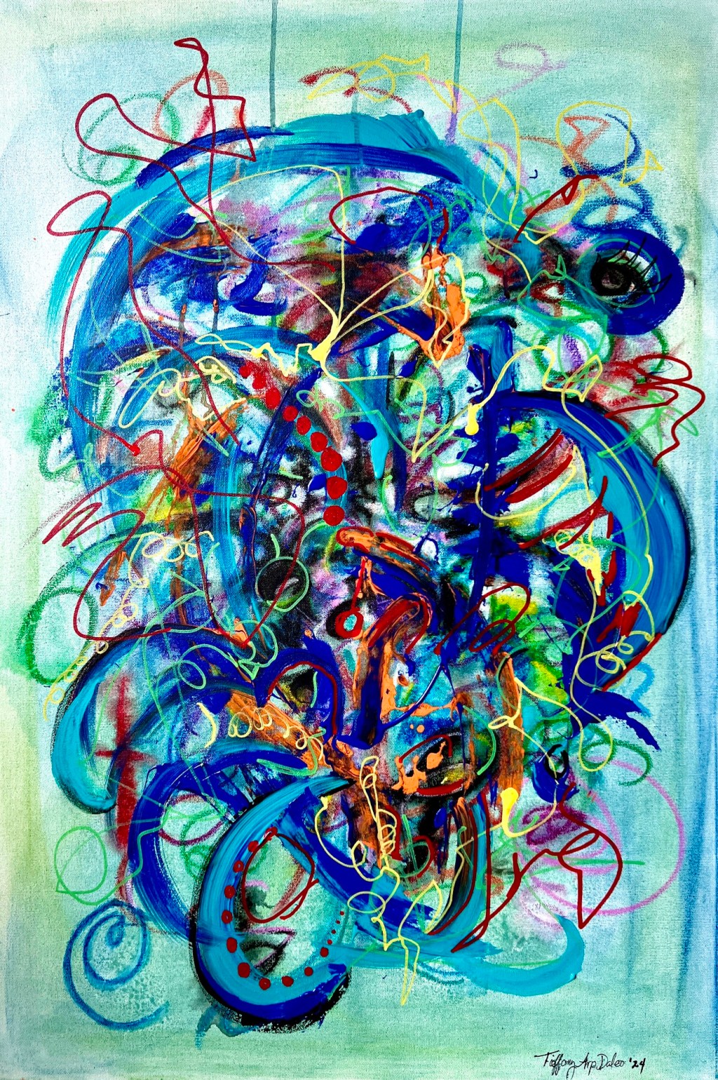
I did the original painting back in 2019 (I think?) I sold several prints and even a coffee mug, the original has been hanging in my room since. After all these years, I decided it needed a facelift!
The canvas is 24/36” and the original was created with pastels and gel pens. I added some bolder colors in acrylic to create some brighter and interesting contrast. I really like it now!

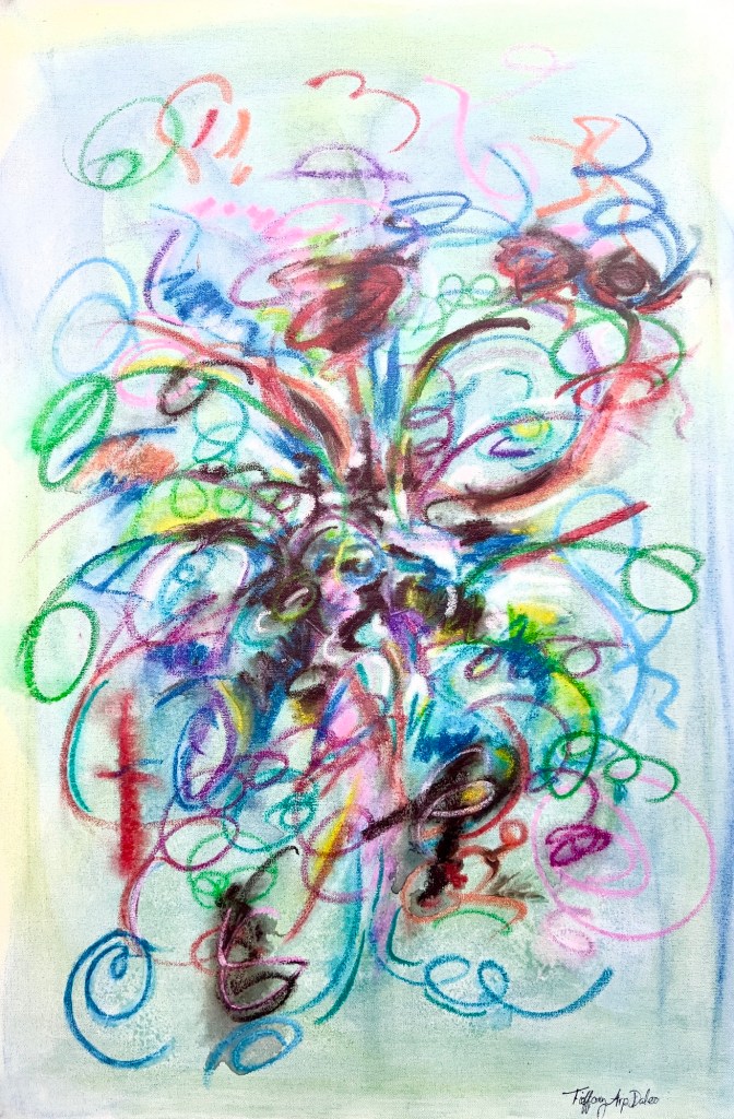
I am sure some people will like the muted, softer version better, and some will prefer the new look, let me know what you think!
The newest version definitely! Has more life in it!
LikeLiked by 1 person
I agree with Phil 🤓
LikeLiked by 1 person
Thanks Phil, I appreciate your opinion!
LikeLiked by 1 person
I like the newer look! Great job! 👏 the energy of the newer one is vibrant and flowing really nicely! 🙂
LikeLiked by 2 people
Thank you so much Ka, I agree! ☺
LikeLiked by 1 person
All the different forms and colours
A beautiful bouquet
LikeLiked by 1 person
Much appreciated, Simon!
LikeLiked by 1 person
Always 🙂
LikeLiked by 1 person
❤️ the revision
LikeLiked by 1 person
Thanks Matt!
LikeLike
Did you guys ever get a mint variation of Starburst candy? We had then here.
Your images remind me of those. Different shades of green…
LikeLiked by 1 person
Not that I can recall, Pete, but I loved the regular Starburst back in the day! 😂
LikeLiked by 1 person
I like the new and improved, but I prefer the open, lighter feeling of the original.
LikeLiked by 2 people
I’m wavering, Timothy. I agree with what you’ve said about the original too.
LikeLiked by 2 people
Thank you for your opinion Tim, I too like both, for different moods!
LikeLiked by 1 person
I like aspects of both, but if I had to pick, probably the new one. It has more depth and interest.
LikeLiked by 1 person
Thanks for chiming in Chris! Yes, I like both but the bolder new version feels right for now! 😉
LikeLiked by 1 person
Wow!
LikeLiked by 1 person
Thanks Nancy!
LikeLiked by 1 person
I like the busy one-complex, energetic, not restful and with your love of color.
LikeLike
Thank you so much David!
LikeLike
Wow! What a great representation of your creativity, Tiffany! And i bet there might be a bold acrylic some day you might transform softer – only you will know when or what and why – love i! ❤️
LikeLiked by 1 person
It’s always great to hear from you Adan! Thank you, yes, sometimes I feel the need for a change, in all parts of life, sometimes it’s needed! 😉
LikeLike
The revamped version is teeming with color and vibrancy.
LikeLiked by 1 person
Thanks so much Jeff, and it brings a whole new pop of drama to my wall!
LikeLiked by 1 person
Thanks for sharing this idea Anita
LikeLiked by 1 person
Thank you for visiting Anita!
LikeLiked by 2 people
I think the revision brings in extra complexity that holds your attention – well it does mine. The vibrancy of colour also helps. Yeah, a good step forward, Tiffany.
LikeLiked by 1 person
I always appreciate your expert opinion, thanks Graham! ☺
LikeLiked by 1 person
Beautiful Tiffany, what wonderful colors. It shows us many different things. I love that about pieces. This is a rich and happy piece. Sending big hugs and love to you and your honey for Easter. Joni
LikeLiked by 1 person