
I’ve always been visually attracted to architecture, there must be a connection to my love of painting cityscapes.
I used to love drafting class in high school. All the lines were perfect, nice and neat and square. At that time, I liked the exactness. Somewhere down the line, I decided abstract with no order is much more fun!
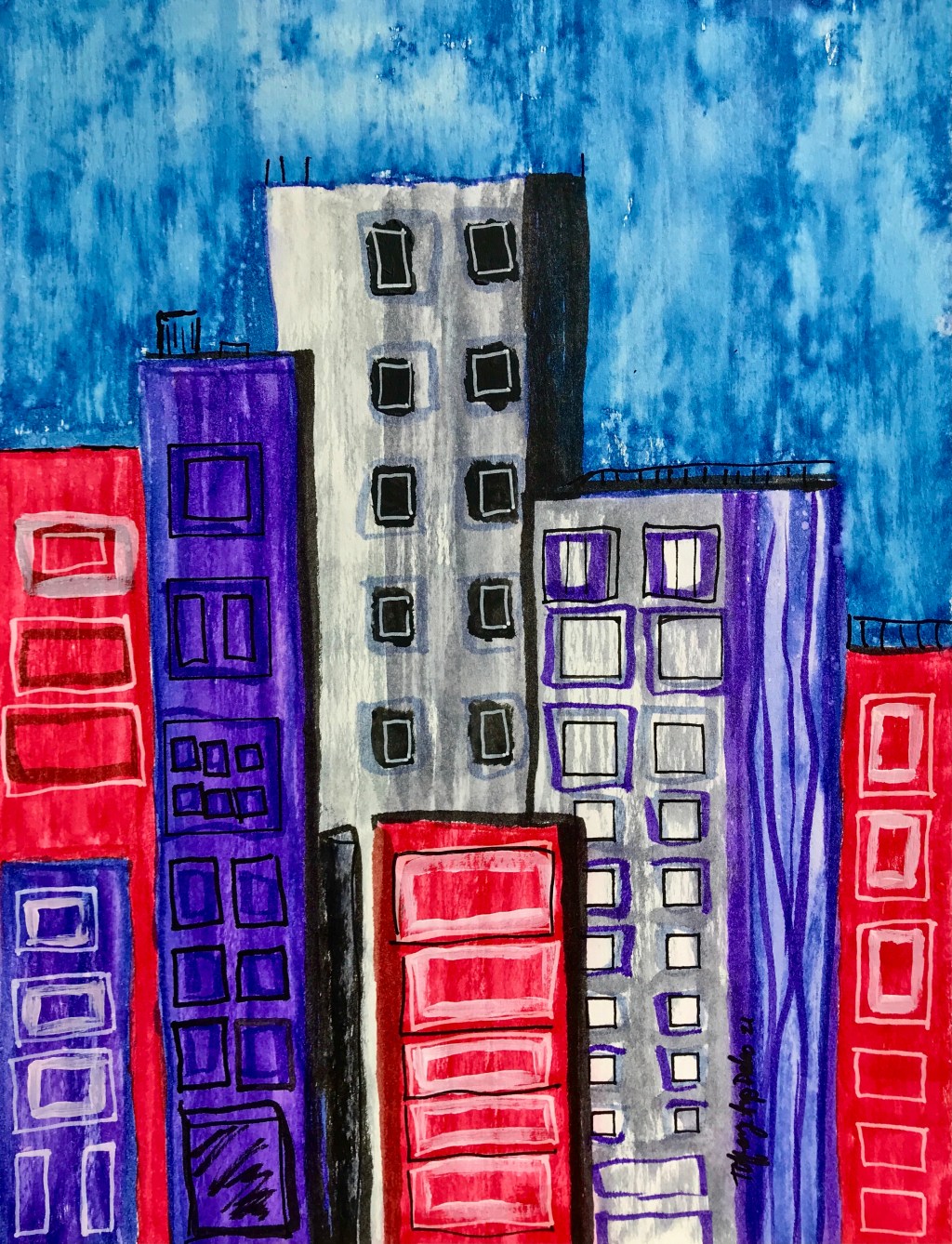
My cityscapes are still abstract, I never want them to be too literal so I keep them slightly askew and not square. This one really isn’t that gloomy, but the simple tones are subtle and the mood darker than my normal colorful pieces.
Mostly watercolor with a little acrylic and a little pen, “City of Gloom” is available as a print, poster or even a tee-shirt at my Fine Art America site!

Leave a comment